Calculating Genome Sizes from Flow Cytometry Data In R
Last Updated: 2024-11-06
Intro
Flow cytometry is an easy way to measure plant genome sizes for polyploid screening, ctyogeography, systematics, and preparing a new species for genome assembly. It relies on chopping or grinding leaf tissue to extract whole nuclei, staining the DNA with a fluorescent dye (usually propidium iodide), measuring the fluorescence of each nucleus with a flow cytometer, and comparing the unknown sample to size standards (plant cultivar lines with known genome sizes). Processing the data can require expensive proprietary software depending on the make and model of you flow cytometer. However, if the data can be exported into the Flow Cytometry Standard (.fcs) file formart you can calculate genome sizes in R. My code was adapted from https://www.polarmicrobes.org/analyzing-flow-cytometry-data-with-r/.
General Notes
- As good practice, at the beginning of each experiment I recommend running at least three standards and calculating their linear model and r2. The r2 should be high (>0.99). If not, get someone to check out your flow cytometer
- The y-intercept should also be relatively close to 0, though it may not be exact (again, the numerical value in relative fluorescence units will vary a lot based on your detector sensitivity)$ This can affect your genome size measurements, which is why it's important to use a size standard that's as close to your sample as possible
- I like to measure each sample against two standards and calculate the average, though the accepted practice is to report just the value based on the single nearest standard
Dependencies
Reading the .fcs files relies on the flowCore package available through BioConductor. Other common packages I use for manipulating and plotting the data are dplyr, ggplot2, and ggpubr.
library("flowCore")
library("ggplot2")
library("ggpubr")
library("dplyr")
Working Environment
I export my .fcs files to a new directory each day and set my R working directory there.
setwd("~/Projects/Isoetes/Flow Cytometry/20240604/")
Then I set the file name as a variable.
f.name <- 'Inks_HH_4b_#2_+_radish.fcs'
The .fcs file gets read and converted into a dataframe.
fcm <- read.FCS(f.name)
fcm <- as.data.frame((exprs(fcm)))
Find the Peaks
In order to locate the peaks used for the genome size calculation, I plot all of the data as a 2D-histogram of fluorescence height vs fluorescence area. These are called YL1-H and YL1-A in the output from our Attune NxT, but may differ in your flow cytometer. This plot usually allows you to separate the true nuclei data from noise generated by subcellular junk that also has some fluorescence. If your nuclei points are too close to the noise, increasing the sensitivity of the detectors on the machine and remeasuring the sample may help.
ggplot(fcm, aes(x=fcm$`YL1-A`, y=fcm$`YL1-H`) ) +
  geom_bin2d(bins = 100) +
  scale_fill_continuous(type = "viridis") +
  scale_x_continuous(breaks = scales::pretty_breaks(n=15)) +
  scale_y_continuous(breaks = scales::pretty_breaks(n=15)) +
  xlab("YL1-A") +
  ylab("YL1-H") +
  theme_bw()
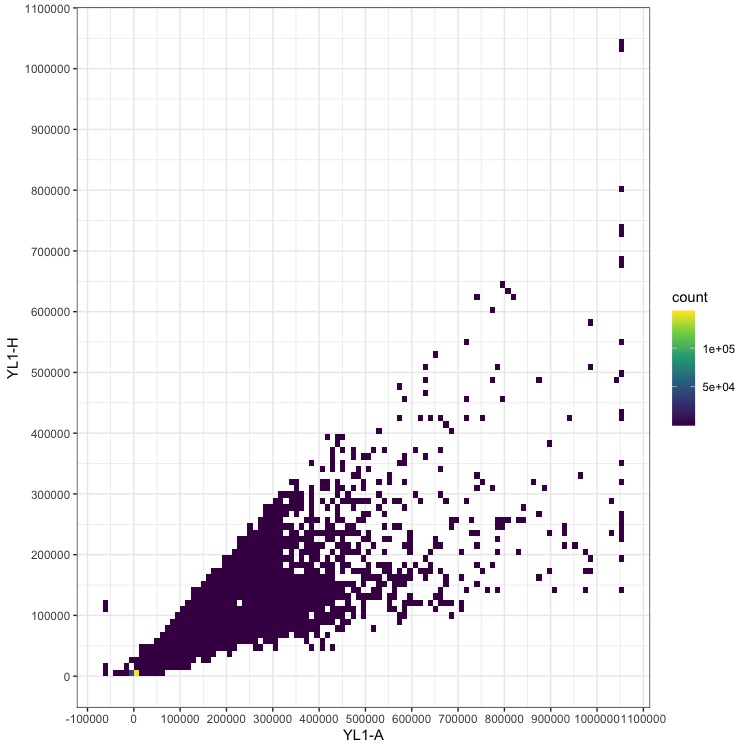
This plot doesn’t look like much except a broad range of low-abundance data and high counts near 0, 0. Note that the numbers on the axes are relative fluorescence units, and will vary depending on your machine and detector settings.
Adding log transformation to the color scale can help reveal where the data we want are located.
Replace the scale_fill_continuous line above with:
scale_fill_continuous(type = "viridis", trans = "log") +
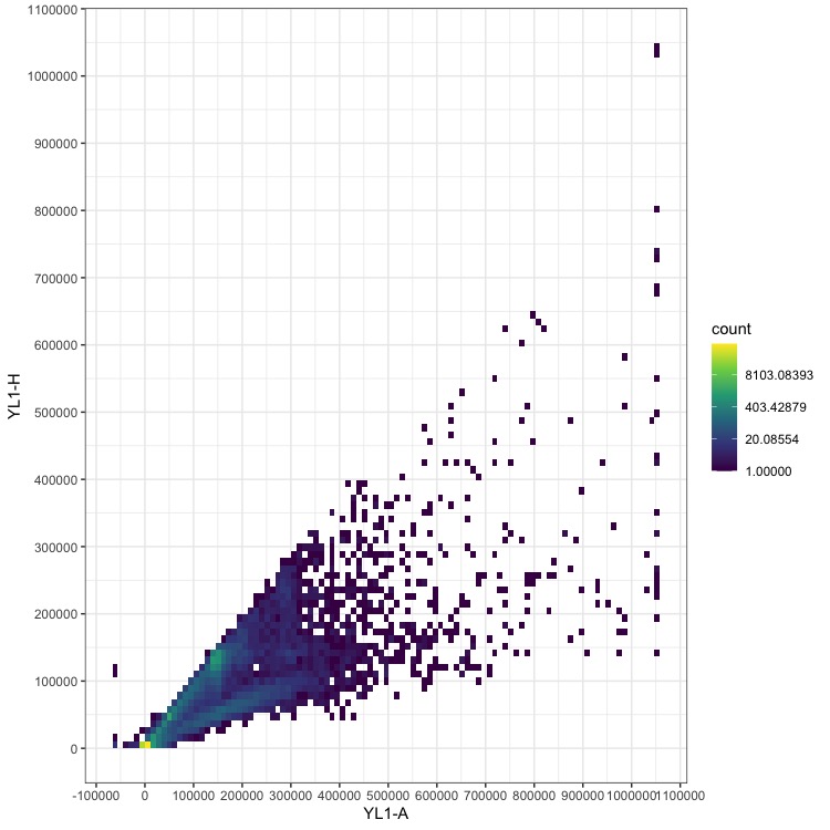
Now we can start to see additional data centering approximately on the x = y line, which is where the true nuclei measurements should lie.
To home in on the nuclei, I set the bounds of X and Y axes to eliminate most of the noisy data, i.e. high number of small particles (near the plot origin) and rare large particles. For this example, I’d start with these:
pia.ll <- 10000 # YL1-A lower limit
pia.ul <- 300000 # YL1-A upper limit
pih.ll <- 10000 # YL1-H lower limit
pih.ul <- 300000 # YL1-H upper limit
Filter the dataframe with the code below to remove points outside the boundaries you set, then plot again.
fcm$`YL1-A`[fcm$`YL1-A` <= pia.ll| fcm$`YL1-A` >= pia.ul | fcm$`YL1-H` <= pih.ll | fcm$`YL1-H` >= pih.ul] <- NA
fcm <- na.omit(fcm)
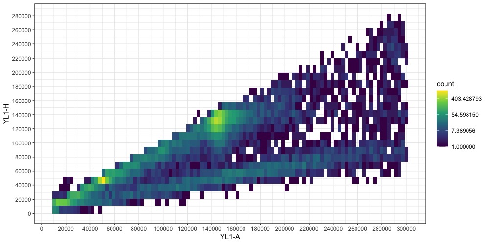
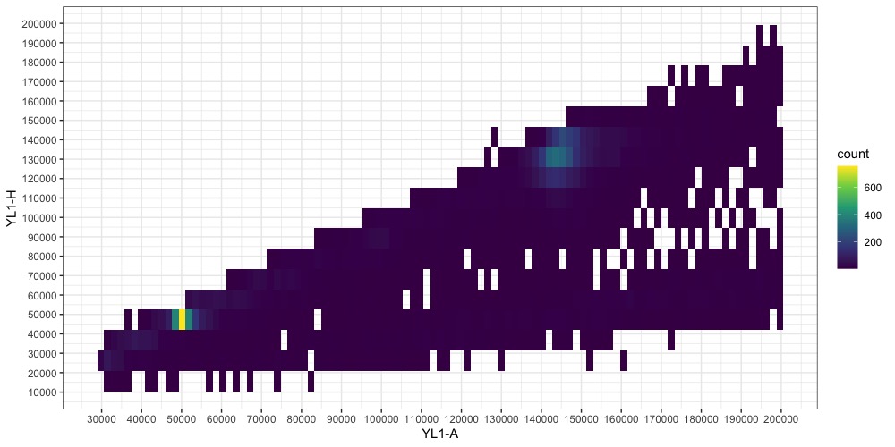
The two points representing our nuclei (one for the sample, one for the standard) are becoming more clear. One is around YL1-A = 50000, the other at YL1-A = 145000. Note that you may have additional smaller points from cells in your plants that underwent endoreduplication. They should be easy to identify as they will be multiples of the majority nuclei size. (Aside: I don’t know where the fainter line at x ≈1/3y comes from. Write to tell me if you do !)
We can refine this figure a bit more by narrowing the bounds again. Now it’s important to note that the points aren’t exactly at x = y, and the YH1-A and YH1-H limits might need to be set differently to capture the full distribution of the nuclei data. When in doubt, wider is always better to make sure you aren’t throwing away useful information. Also, if you over-filtered the first time and need to expand the bounds, you will need to regenerated the dataframe and read the data from the file again.
pia.ll <- 30000 # YL1-A lower limit
pia.ul <- 200000 # YL1-A upper limit
pih.ll <- 20000 # YL1-H lower limit
pih.ul <- 200000 # YL1-H upper limit

fcm$`YL1-A`[fcm$`YL1-A` <= pia.ll| fcm$`YL1-A` >= pia.ul | fcm$`YL1-H` <= pih.ll | fcm$`YL1-H` >= pih.ul] <- NA
fcm <- na.omit(fcm)
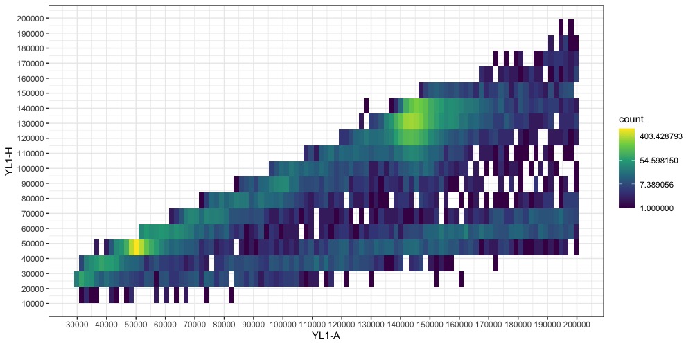
Switching back to a non-transformed colorscale can also help identify the peaks now.
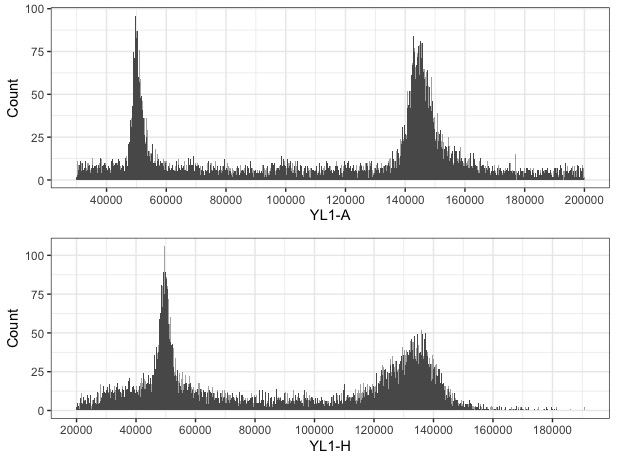
Once we have a good idea of where the nuclei peaks are, we can visualize YL1-A and YL1-H as separate histograms the peaks should be obvious.
Calculate Genome Size
The genome size is calculated from the linear relationship of relative fluorescence between the sample and standard with the equation:
Sample 2C DNA content = (Sample G1 peak median/Standard G1 peak median) * Standard 2C DNA content
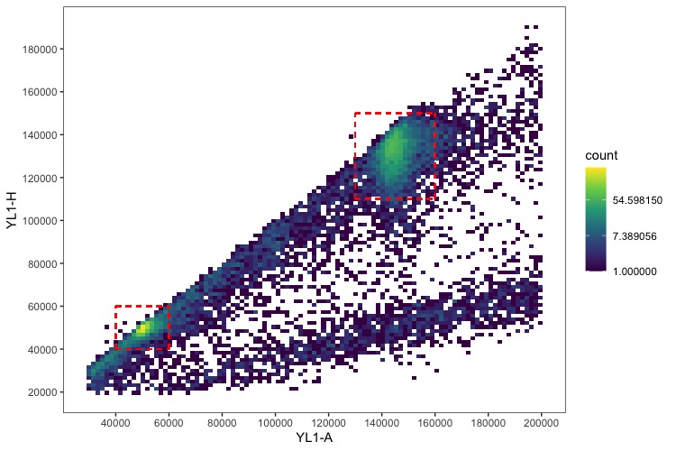
Based on the peaks in the histograms, I set the range that captures each and calculate the median:
pia.standard.ll <- 40000  # YL1-A lower limit of peak
pia.standard.ul <- 60000 # YL1-A upper limit of peak
pih.standard.ll <- 40000  # YL1-H lower limit of peak (if unsure, use same as pia.ll)
pih.standard.ul <- 60000  # YL1-H upper limit of peak (if unsure, use same as pia.ul)
median(fcm$`YL1-A`[fcm$`YL1-A` >= pia.standard.ll & fcm$`YL1-A` <= pia.standard.ul & fcm$`YL1-H` >= pih.standard.ll & fcm$`YL1-H` <= pih.standard.ul])

pia.sample.ll <- 130000  # YL1-A lower limit of peak
pia.sample.ul <- 160000 # YL1-A upper limit of peak
pih.sample.ll <- 110000  # YL1-H lower limit of peak (if unsure, use same as pia.ll)
pih.sample.ul <- 150000  # YL1-H upper limit of peak (if unsure, use same as pia.ul)
median(fcm$`YL1-A`[fcm$`YL1-A` >= pia.sample.ll & fcm$`YL1-A` <= pia.sample.ul & fcm$`YL1-H` >= pih.sample.ll & fcm$`YL1-H` <= pih.sample.ul])
Take those median values that are output, plug them into the equation along with your standard’s 2C value, and you’re done! I usually do the calculations and store the data in an Excel spreadsheet. You can also draw the bounding boxes over the data to ensure you’re accurately capturing it.
ggplot(fcm, aes(x=fcm$`YL1-A`, y=fcm$`YL1-H`) ) +
  geom_bin2d(bins = 100) +
  scale_fill_continuous(type = "viridis", trans = "log") +
  scale_x_continuous(breaks = scales::pretty_breaks(n=10)) +
  scale_y_continuous(breaks = scales::pretty_breaks(n=10)) +
  geom_segment(aes(x = pia.sample.ll, y = pih.sample.ll, xend = pia.sample.ul, yend = pih.sample.ll), linetype="dashed", alpha = 0.5, color = "red") +
  geom_segment(aes(x = pia.sample.ll, y = pih.sample.ll, xend = pia.sample.ll, yend = pih.sample.ul), linetype="dashed", alpha = 0.5, color = "red") +
  geom_segment(aes(x = pia.sample.ul, y = pih.sample.ll, xend = pia.sample.ul, yend = pih.sample.ul), linetype="dashed", alpha = 0.5, color = "red") +
  geom_segment(aes(x = pia.sample.ll, y = pih.sample.ul, xend = pia.sample.ul, yend = pih.sample.ul), linetype="dashed", alpha = 0.5, color = "red") +
  geom_segment(aes(x = pia.standard.ll, y = pih.standard.ll, xend = pia.standard.ul, yend = pih.standard.ll), linetype="dashed", alpha = 0.5, color = "red") +
  geom_segment(aes(x = pia.standard.ll, y = pih.standard.ll, xend = pia.standard.ll, yend = pih.standard.ul), linetype="dashed", alpha = 0.5, color = "red") +
  geom_segment(aes(x = pia.standard.ul, y = pih.standard.ll, xend = pia.standard.ul, yend = pih.standard.ul), linetype="dashed", alpha = 0.5, color = "red") +
  geom_segment(aes(x = pia.standard.ll, y = pih.standard.ul, xend = pia.standard.ul, yend = pih.standard.ul), linetype="dashed", alpha = 0.5, color = "red") +
  xlab("YL1-A") +
  ylab("YL1-H") +
  theme_bw() +
  theme(panel.grid.major = element_blank(), panel.grid.minor = element_blank())
To count the number of events (nuclei) in each peak, use the same bounds set for measuring their fluorescence and run:
length(fcm$`YL1-A`[fcm$`YL1-A` >= pia.standard.ll & fcm$`YL1-A` <= pia.standard.ul & fcm$`YL1-H` >= pih.standard.ll & fcm$`YL1-H` <= pih.standard.ul])
length(fcm$`YL1-A`[fcm$`YL1-A` >= pia.sample.ll & fcm$`YL1-A` <= pia.sample.ul & fcm$`YL1-H` >= pih.sample.ll & fcm$`YL1-H` <= pih.sample.ul])